About
OpenDyslexic is a new open sourced font created to increase readability for readers with dyslexia. The typeface includes regular, bold, italic, and bold-italic styles, and 2 typefaces: OpenDyslexic, and OpenDyslexic-Alta. It was created to help with my reading, and is being updated continually and improved based on input from other dyslexic users. There are no restrictions on using OpenDyslexic.
OpenDyslexic is created to help with some of the symptoms of dyslexia. Letters have heavy weighted bottoms to indicate direction. You are able to quickly figure out which part of the letter is down which aids in recognizing the correct letter, and sometimes helps to keep your brain from rotating them around. Consistently weighted bottoms can also help reinforce the line of text. The unique shapes of each letter can help prevent confusion through flipping and swapping.
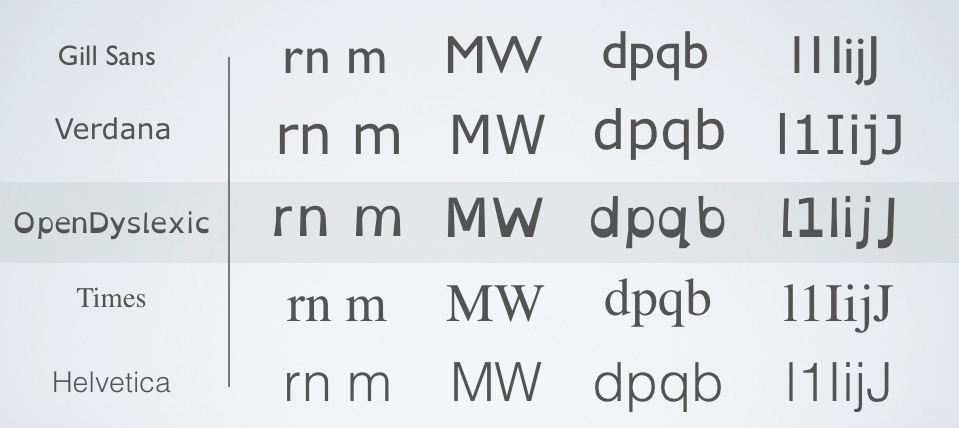
OpenDyslexic uses unique letter shapes, to help prevent confusion.

A heavier bottom is used to show which way is supposed to be down. OpenDyslexic also has other features, like wider letter spacing and a unique italic style.
OpenDyslexic 3:
Suggestions from French and Canadian teachers, particularly Charade-Estel, whose more significant suggestions never quite made it into OpenDyslexic 2.
The newest version of OpenDyslexic includes these changes.
Typefaces that helped inspire the look:
Signika, Chalkboard SE, Baskerville, Source Sans Pro, Consolas, Averia